On this page
Redesigning the send funds experience
A wallet built for the way people actually move money. Designed to make digital dollars feel as natural as cash: send, hold, and spend without thinking about the rails underneath.
My Role
Lead Product Designer
Company
Sorbet
Timeline
2 weeks (2026)
Team
8 cross-functional
Responsibilities
Overview
Sorbet is a stablecoin neobank for SMBs and freelancers
Sorbet builds financial tools for businesses and freelancers in the MENA region, letting them hold, send, and receive stablecoins like USDC and USDT as easily as traditional currency. The platform handles wallets, invoicing, payments, and recipient management, all designed to make crypto infrastructure invisible so users can focus on moving money.
The Problem
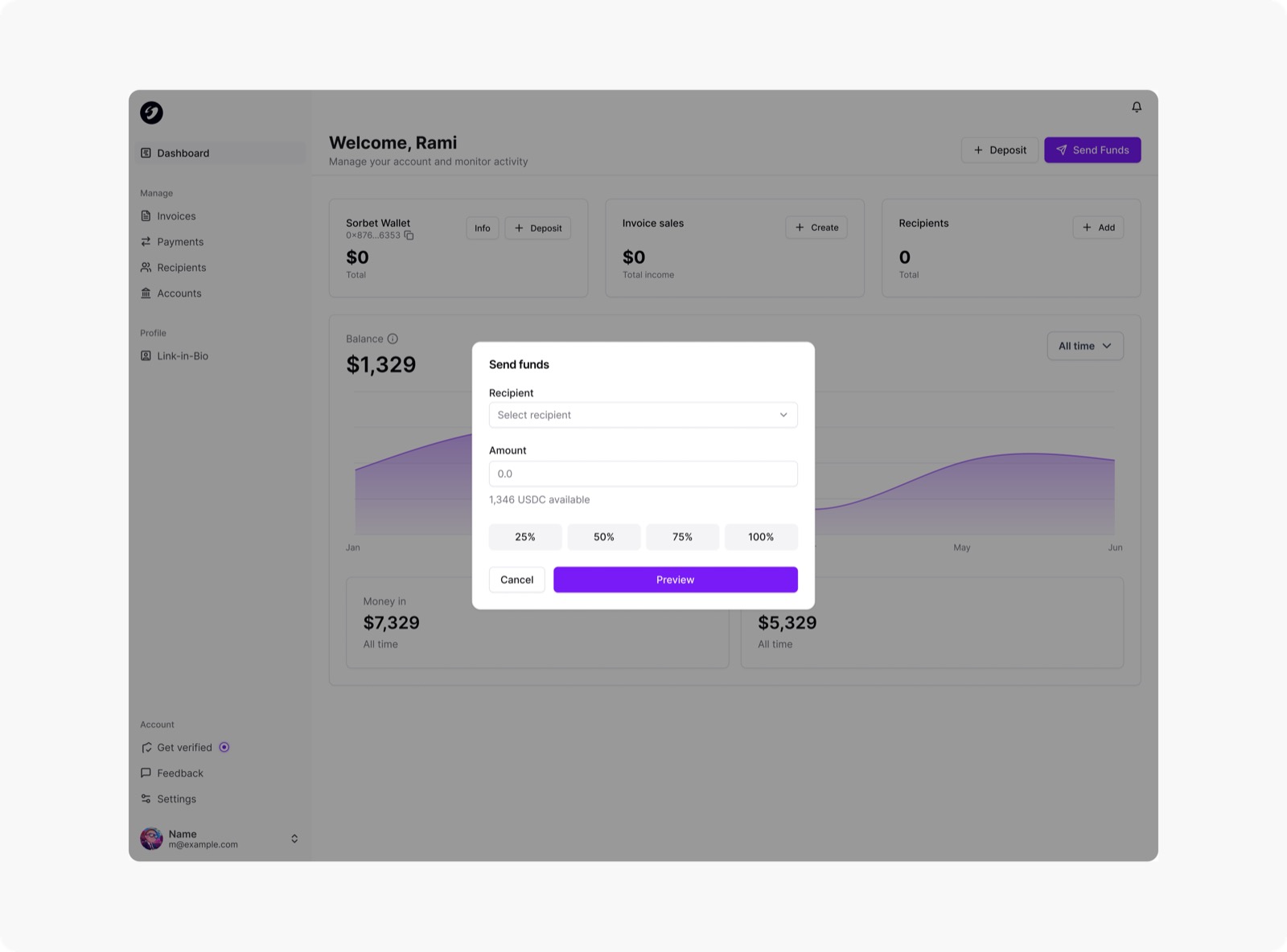
MVP designs were functional but not detailed enough, and users were feeling it
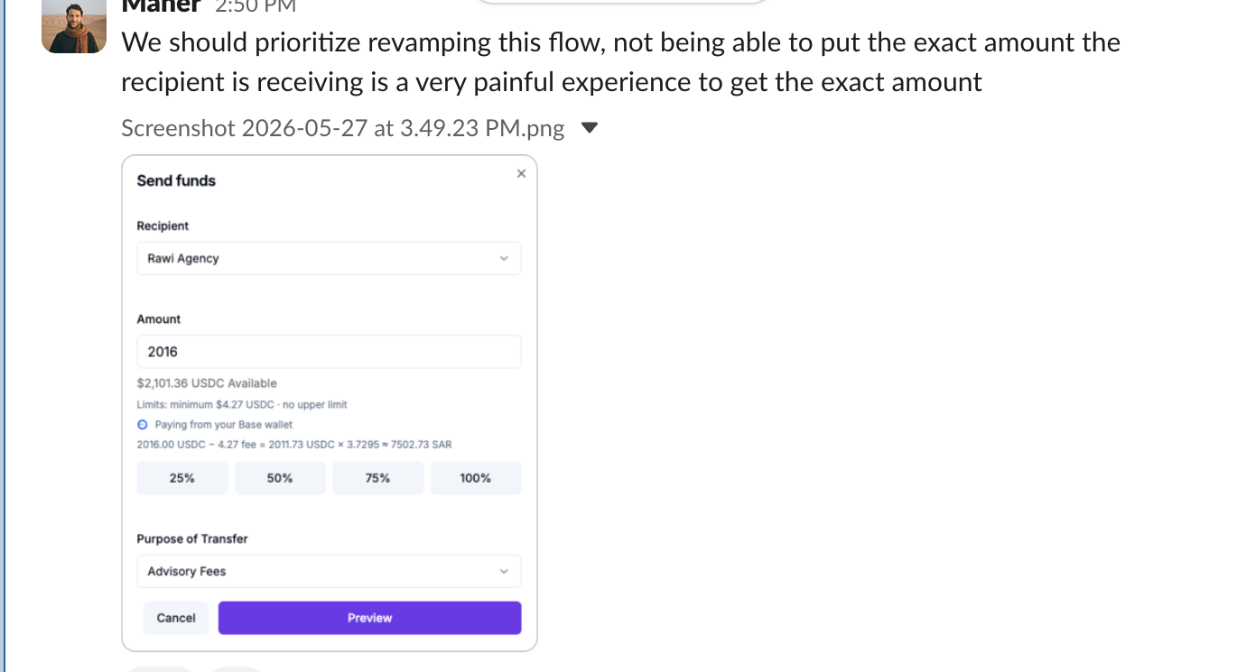
Sorbet launched with MVP-level designs for the send funds flow. Enough to ship, but not refined enough for everyday use. Users were running into friction at key moments: unclear input states, confusing recipient selection, and a lack of confirmation feedback that left people unsure whether their money had actually been sent. The experience needed a ground-up redesign to match the confidence users expect from a financial product.
“Not being able to put the exact amount the recipient is receiving is a very painful experience to get the exact amount.”
Research
We started by studying how competitors handle their send flows
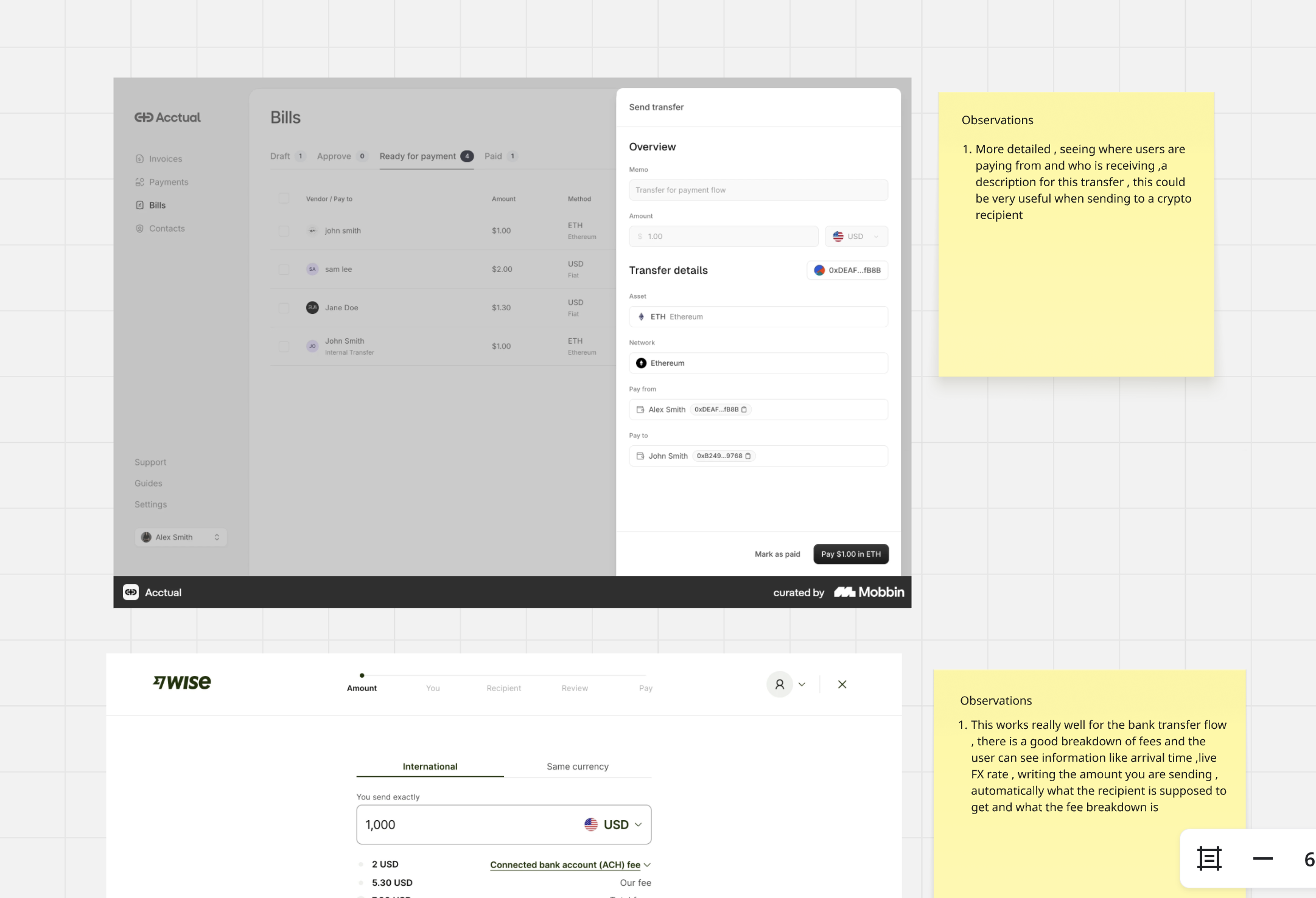
We looked at established bank webapps like Wise, and crypto-native competitors like Acctual and Altitude, analysing how each structured their send experience. Key observations: Acctual showed clear sender/recipient context, transfer descriptions, and detailed asset and network info, useful patterns for crypto sends. Wise excelled at the bank transfer flow with a full fee breakdown, live FX rates, arrival times, and automatic recipient-receives calculations.
These benchmarks made the gaps in our own flow obvious:
No exact amounts
Users could only choose percentages of their balance. There was no way to input the exact amount they wanted to send
No send breakdown
No visibility into how much the recipient would actually receive, whether sending to a crypto wallet or via bank transfer
No balance education
Nothing told users their balance was a digital dollar balance made up of USDC and USDT. The underlying assets were invisible
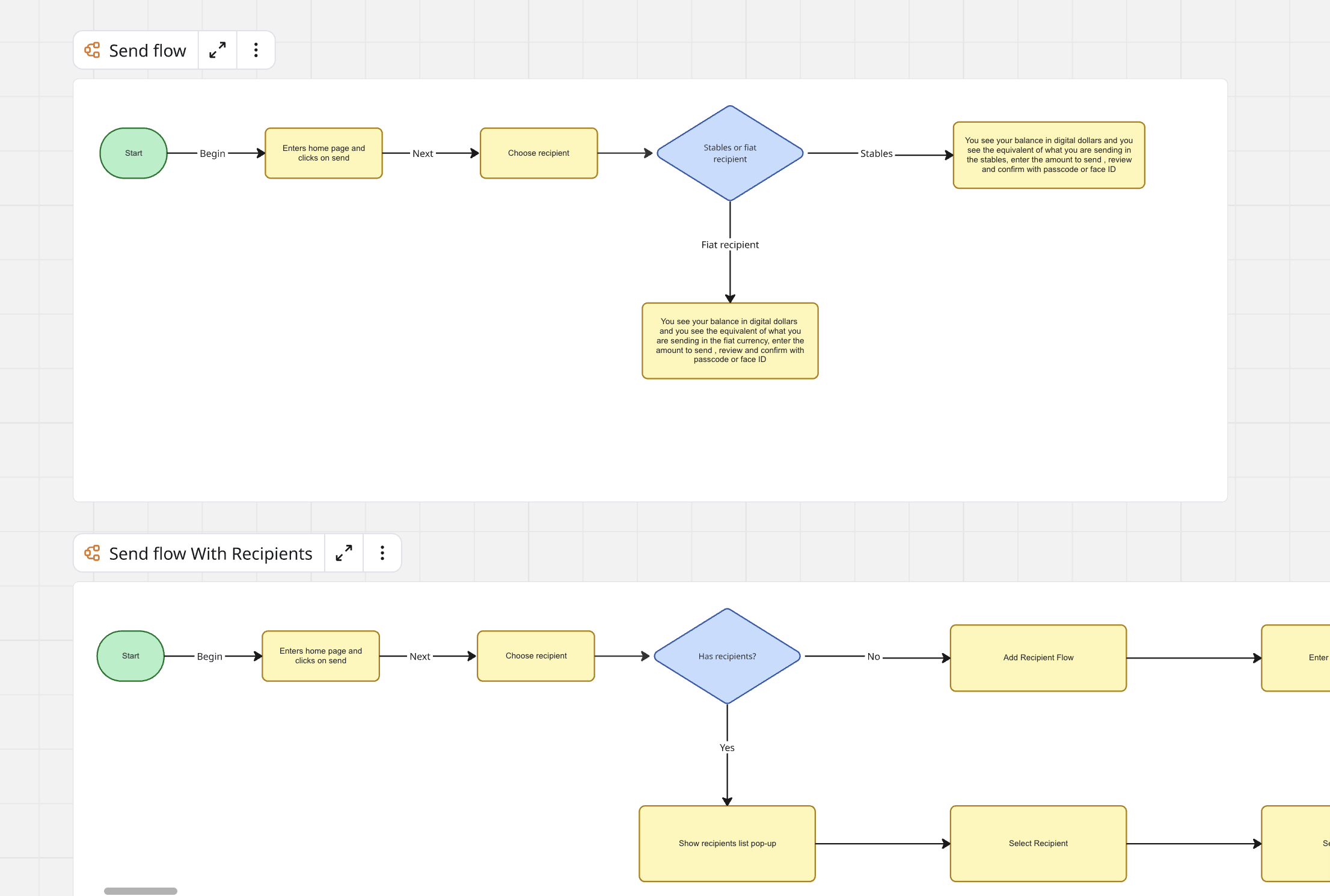
The founder had created an initial user flow for the send experience. I took that as a starting point and expanded it significantly, mapping out edge cases like new vs. existing recipients, stablecoin vs. fiat paths, and the confirmation and authentication steps. The expanded flow made sure we wouldn't miss anything when we moved into explorations.
Exploration
I explored three directions before converging
To move fast, I converted our design system into a markdown file and used it to build a prototype playground with Claude, letting me spin up and test concepts in code without waiting on handoffs. Each iteration sharpened our understanding of what the flow actually needed.
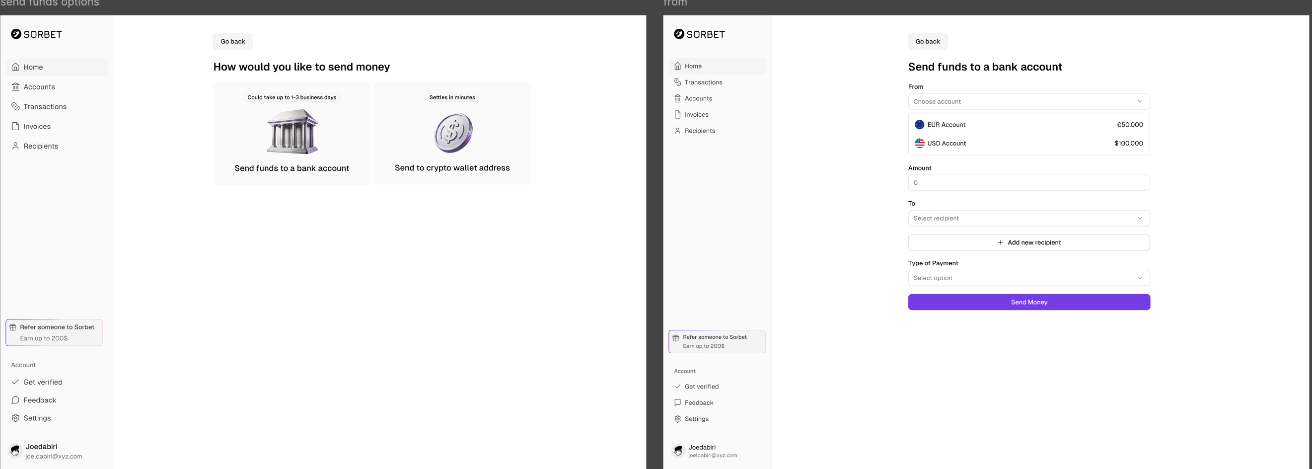
Exploration 01
Traditional form approach
Essentially the MVP with a fresh coat of paint. A standard options page followed by a long-form input layout. Functional but vague, and structurally not that different from what we were moving away from.
open_in_fullClick to expand
Exploration 02
Inline recipient creation in send flow
First-time users had to leave the send flow entirely to add a recipient. We embedded the full recipient form inline to eliminate that detour, but too many fields competing for space made the result feel cramped and overwhelming.
open_in_fullClick to expand
Exploration 03
Expandable inline recipient fields
A refinement. Recipient fields started collapsed and expanded inline when adding a bank recipient. But the expansion pushed the amount input and send button down the page, burying the primary action and feeling disorienting on shorter viewports.
Exploration 04
Recipient type picker with tab switcher
First-time users choose a recipient type upfront. The form autocompletes into the transaction and the recipient is saved automatically as a recent. Returning users get a clean tab switcher to navigate between recipient types without the cramped, overwhelming feel of earlier attempts.
open_in_fullClick any video to expand and watch the full interaction
First-time user
Returning user
Constraints
Onboarding was paused. We had two weeks.
The send flow was broken enough that leadership stopped onboarding new users until it was fixed. That meant a hard two-week window: design, build, ship. No soft launch, no phased rollout. Whatever we put out had to work on day one.
On top of the timeline pressure, the flow had to handle real complexity. When sending from your balance to a crypto recipient, the UI needed to break down your balance into USDC and USDT so users could see exactly what they were sending. If a user wanted to send 100 USDT but only had 60, the system needed to silently convert USDC from their balance to cover the difference. For bank transfers, this breakdown wasn't needed since both stablecoins route through the same fiat rails.
Final Solution
A unified wallet that feels like a money app, not a crypto tool
Two core flows: digital dollars to fiat, and digital dollars to crypto. Both feel the same to the user. Pick a recipient, enter an amount, confirm. The complexity of rails, networks, and conversion happens behind the scenes.
open_in_fullClick any video to expand and watch the full interaction
Digital dollars to fiat
Digital dollars to crypto
Design System
Built a design system to keep things consistent as we scaled
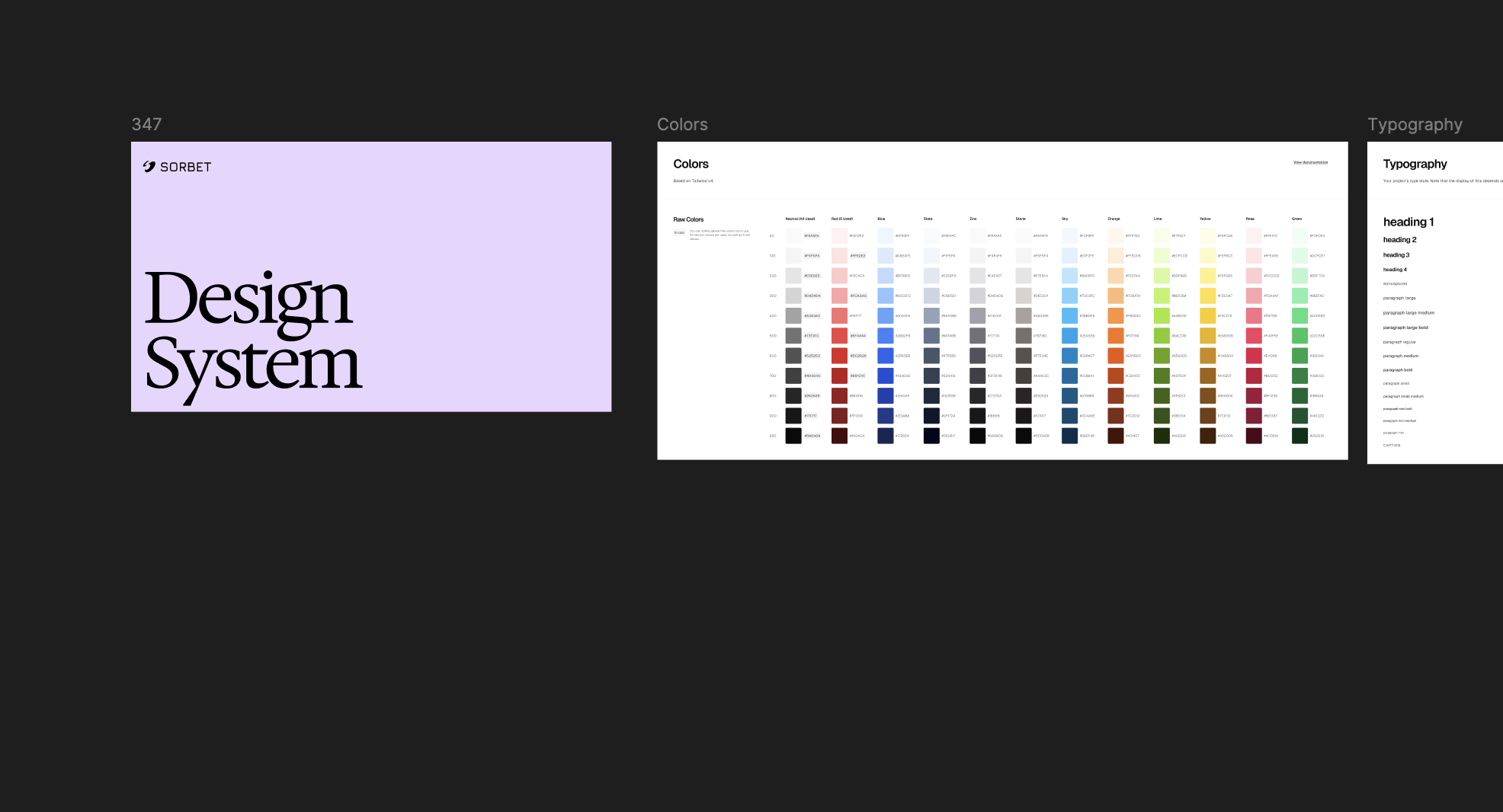
I created a shared component library with colour tokens, typography, spacing, and reusable patterns. This meant the engineering team could build new screens without guessing, and everything stayed visually consistent across the product.
Impact
The new send flow shipped and the numbers moved
After the redesign went live, users were completing sends at a much higher rate. The flow went from being the biggest source of drop-off to one of the most reliable parts of the product.
6.5%
Drop-off rate
Down from 34%
21%
DAU uplift
First 90 days
39%
Faster sends
Avg task time
Reflections
This project reinforced something I keep learning: the hardest design problems aren't visual, they're structural. The send flow looked simple on the surface, but underneath it had to handle multiple currencies, compliance checks, and edge cases that could quietly break trust if we got them wrong.
Creating a playground prototype with Claude allowed us to explore faster. Instead of committing to one direction early, we could spin up multiple concepts in code, test them quickly, and refine the best solution before locking anything in. That speed made it possible to try four distinct approaches in a fraction of the time it would normally take.
Building the design system in parallel with the product was the right call. It slowed us down initially, but by the second quarter the team was shipping features without needing a designer in the loop for every screen. That compounding effect is what made it worth the upfront investment.
More case studies
Other projects I've worked on
Sorbet · Internal Tool · 2026
Building Sorbet Studio
An internal tool where anyone on the team can create on-brand posts using templates.
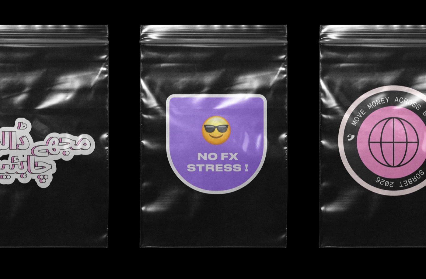
Sorbet · Event Collateral · 2026
Designing event collateral for Sorbet's Pakistan launch
Branded stickers, merch, and banners designed to feel premium, culturally relevant, and unmistakably Sorbet.