Designing the Stablecoin Offramp
How we built a zero-friction flow that lets African businesses convert USDC and USDT directly into local fiat — hitting any bank account in under 30 seconds.
Roles
The team
1 × product manager
1 × product designer
Problem statement
A growing number of African businesses — agencies, contractors, import/export firms — are receiving revenue in stablecoins like USDC and USDT. It's faster, cheaper, and borderless. But when it's time to pay salaries, rent, or suppliers, they hit a wall.
Existing offramp tools are built for crypto-native users: they require blockchain knowledge, long KYC processes, and often take hours to settle. Business operators just want to pay people. They don't want to think about networks and gas fees.
Six steps. One decision at a time.
We designed the offramp as a progressive disclosure flow — each step only shows what's needed right now. No overwhelm. No second-guessing.
Step 1 - Choose withdrawal method
The user picks between sending to a crypto wallet or a bank account. Two clear cards, no ambiguity. Most business users pick bank — that's the primary path.

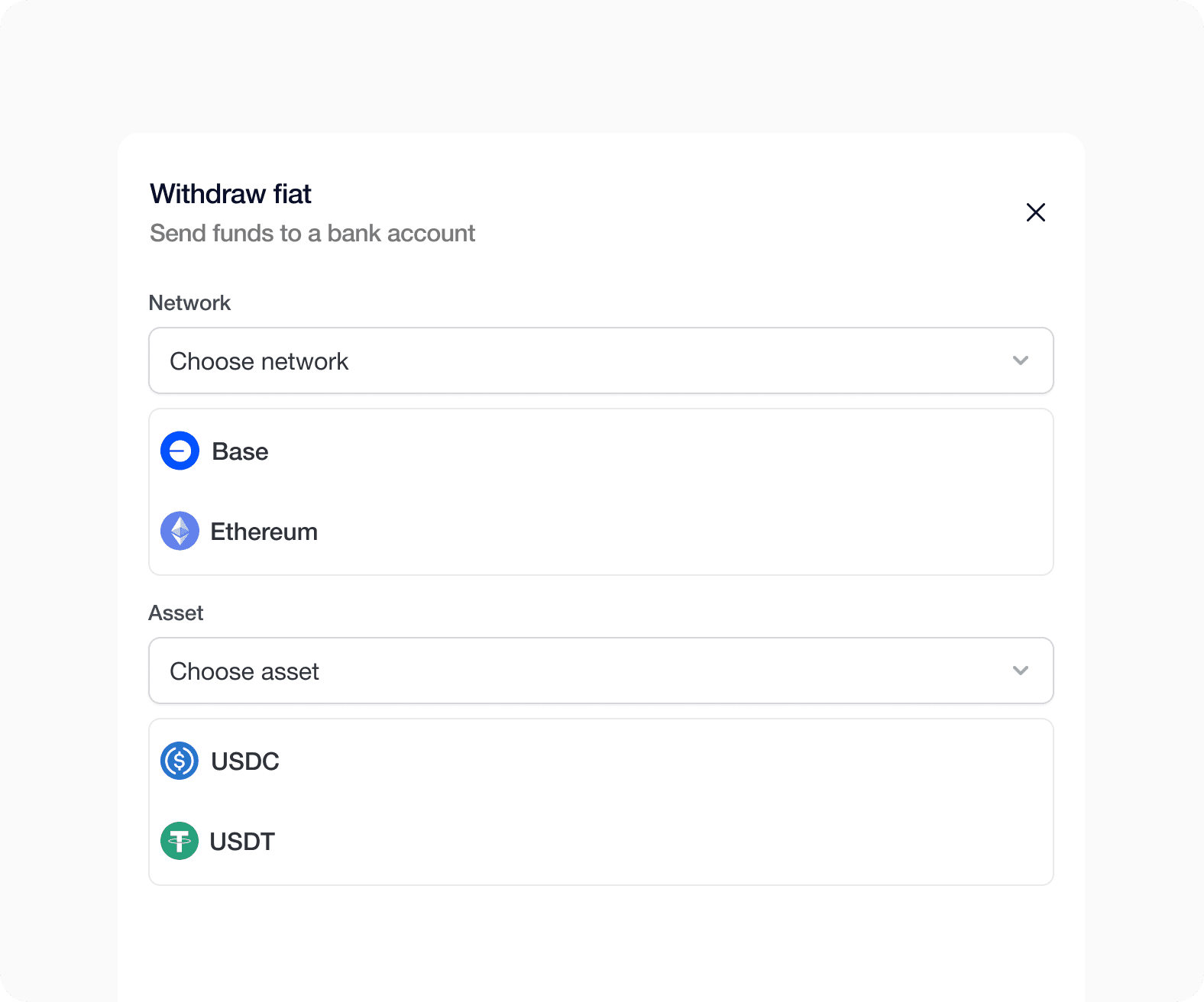
Step 2 - Choose network and asset
Choose the blockchain network (Base or Ethereum) and the stablecoin to convert. Asset options are filtered by network, preventing invalid combinations before they happen.
Step 3 - Choose amount and currency
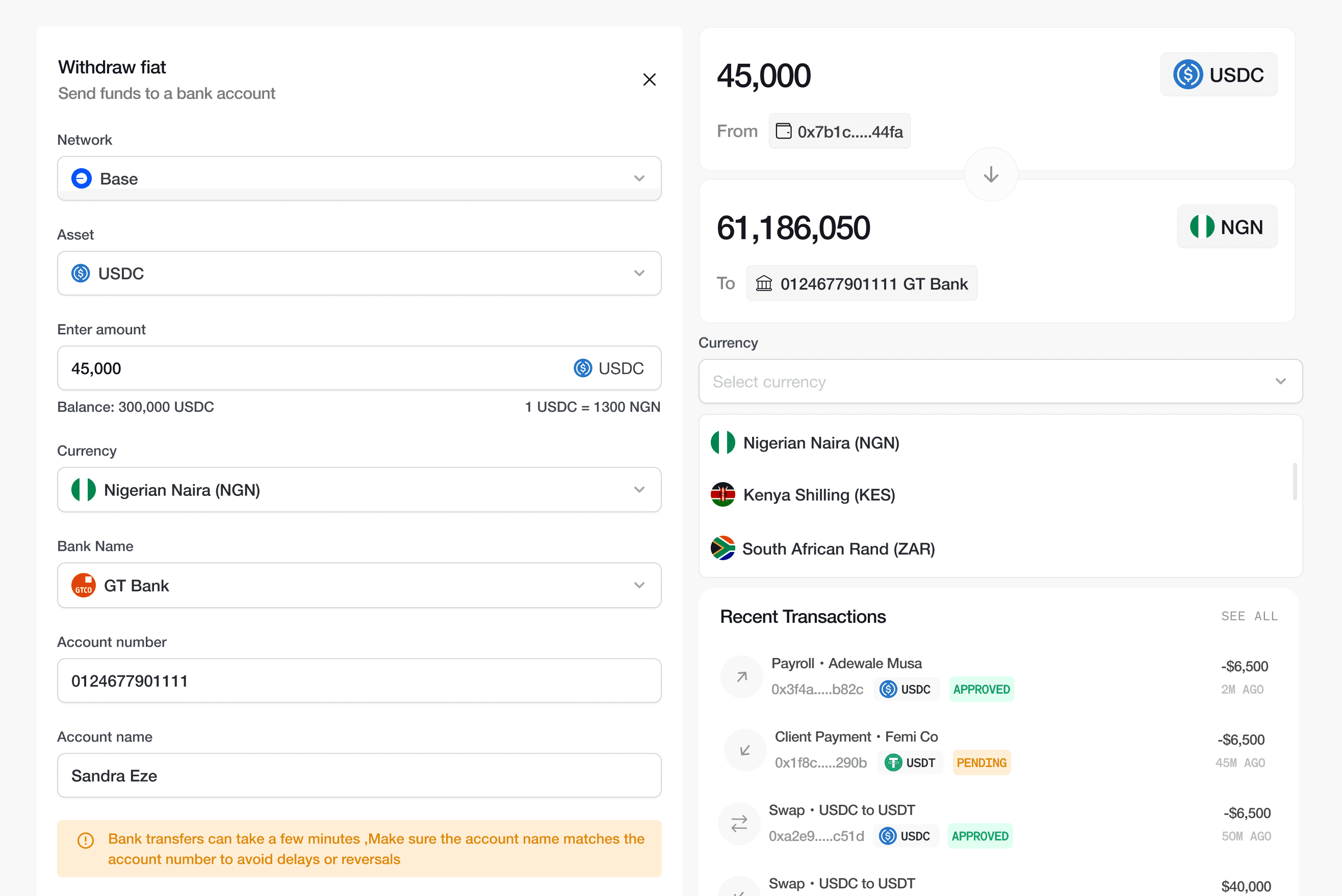
The user types the stablecoin amount they want to send. The live exchange rate appears inline — no separate screen needed. Balance is shown immediately .

Step 4 - Pick bank & enter account
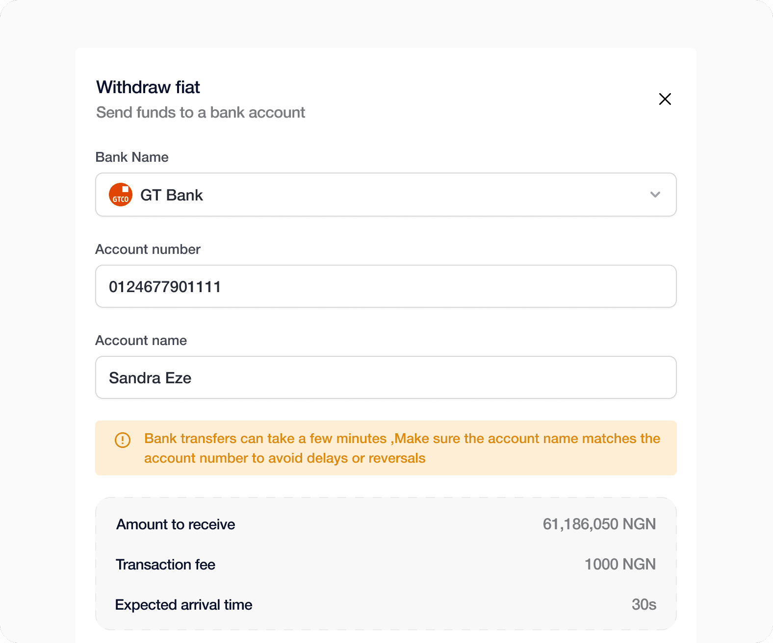
Bank options are filtered by the selected currency. After entering an account number, the account holder's name is auto-resolved and displayed ,reducing reversal risk dramatically, There is also a warning to verify account name.
Step 5 - Pick bank & enter account
A full summary appears — amount to receive, fee, ETA, and a warning to verify account name. The Confirm button is disabled until every field is complete. No silent errors.

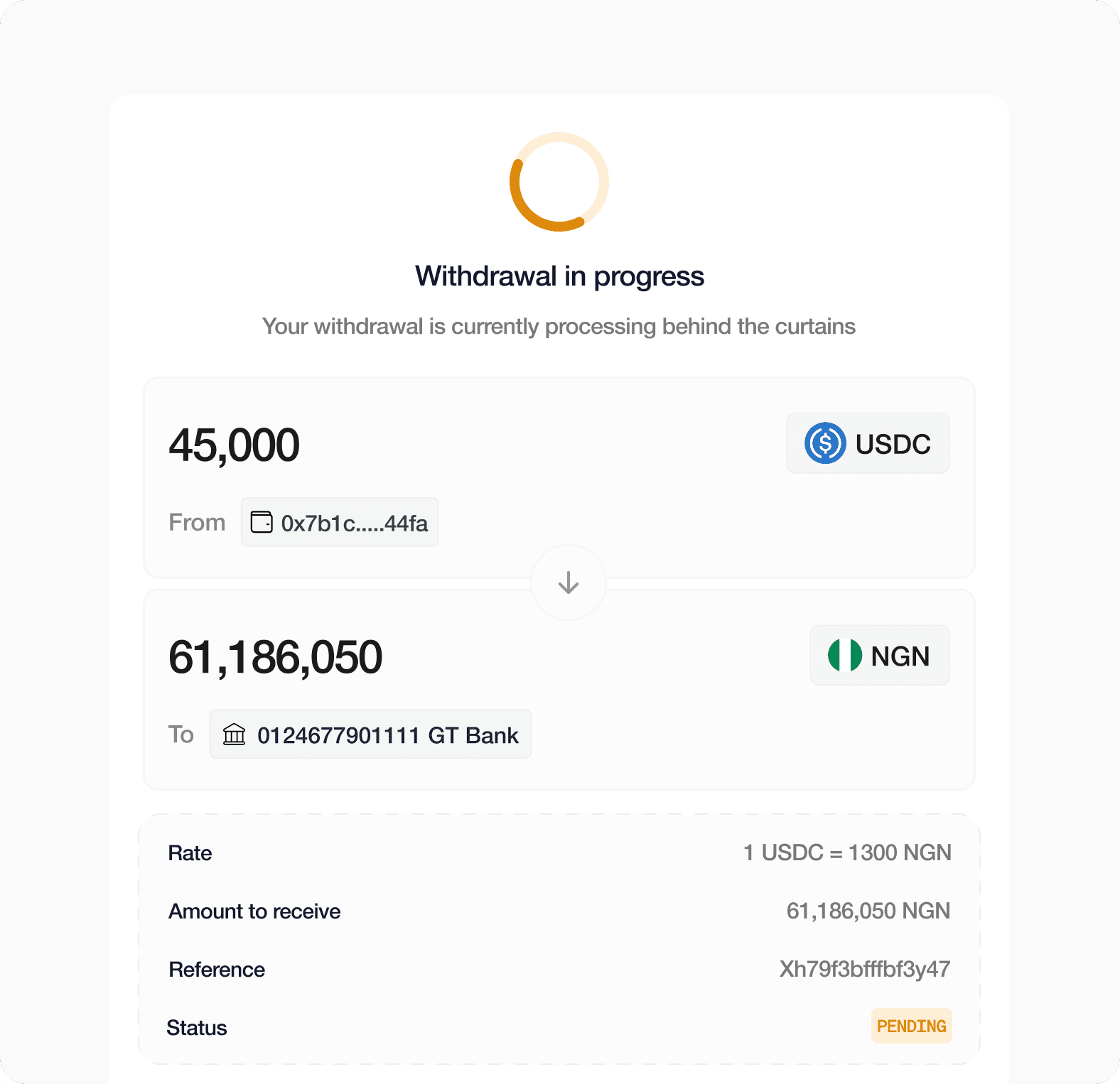
Step 6 - Live processing screen
A full summary appears — amount to receive, fee, ETA, and a warning to verify account name. The Confirm button is disabled until every field is complete. No silent errors.
Design decisions
Slide-in panel, not a full page
Keep the dashboard visible. Users need to see their balance while they withdraw — removing that context kills confidence.
Single form vs. stepped wizard
One scrollable form beats six separate screens. Fields reveal progressively, so it feels guided without feeling slow.
Auto-resolve account name
Type an account number, get the name back instantly. One lookup eliminates an entire category of transfer errors.
Confirm button locked until complete
The button stays grey until every field is done. No errors, no frustration — just a clear signal that you're ready.
Processing screen as full receipt Not a toast. Not a checkmark. A complete record — amount, rate, fee, status — because a $40K transfer deserves more than a green tick.
Built with components
The component library gave design, product, and engineering a single source of truth. When account name auto-resolve was added late in the process, updating the form meant changing one component — not hunting through 15 screens
Outcome
The offramp settles in 30 seconds. Wrong-account reversals dropped to nearly zero after account name auto-resolve shipped. The full flow completes in 6 steps with no dead ends. At launch — Nigeria, Kenya, and South Africa — with GT Bank, Alat by Wema, and Opay live in Nigeria, covering USDC and USDT across Base and Ethereum.
Learnings
Moving money is stressful so we stripped every decision back to one question: does this make the user feel safer? The answer showed up in the details. Auto-resolve wasn't on any brief; it came from watching real users hesitate over an account number. One small lookup nearly eliminated reversals entirely. We learned that repeat users hated multiple screens ,operators running weekly payroll don't need six screens, they need a form that gets out of the way.
Go to next case study

